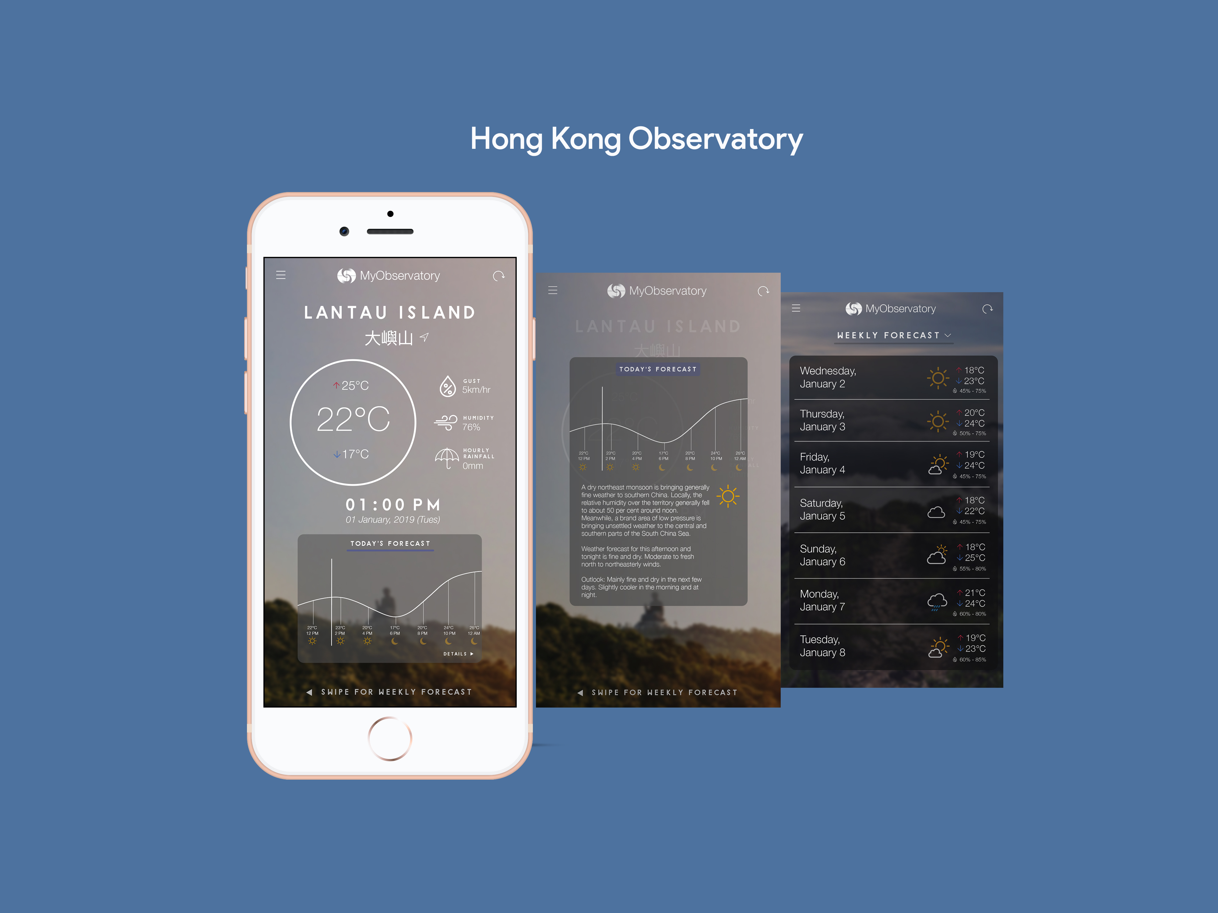
In my penultimate year at City University, I took a UI/UX design course where we were tasked to redesign any application of our choice. I chose the Hong Kong Observatory mobile application, because it’s one of the apps that I use on a daily basis that did not have the most appealing or optimal interface.
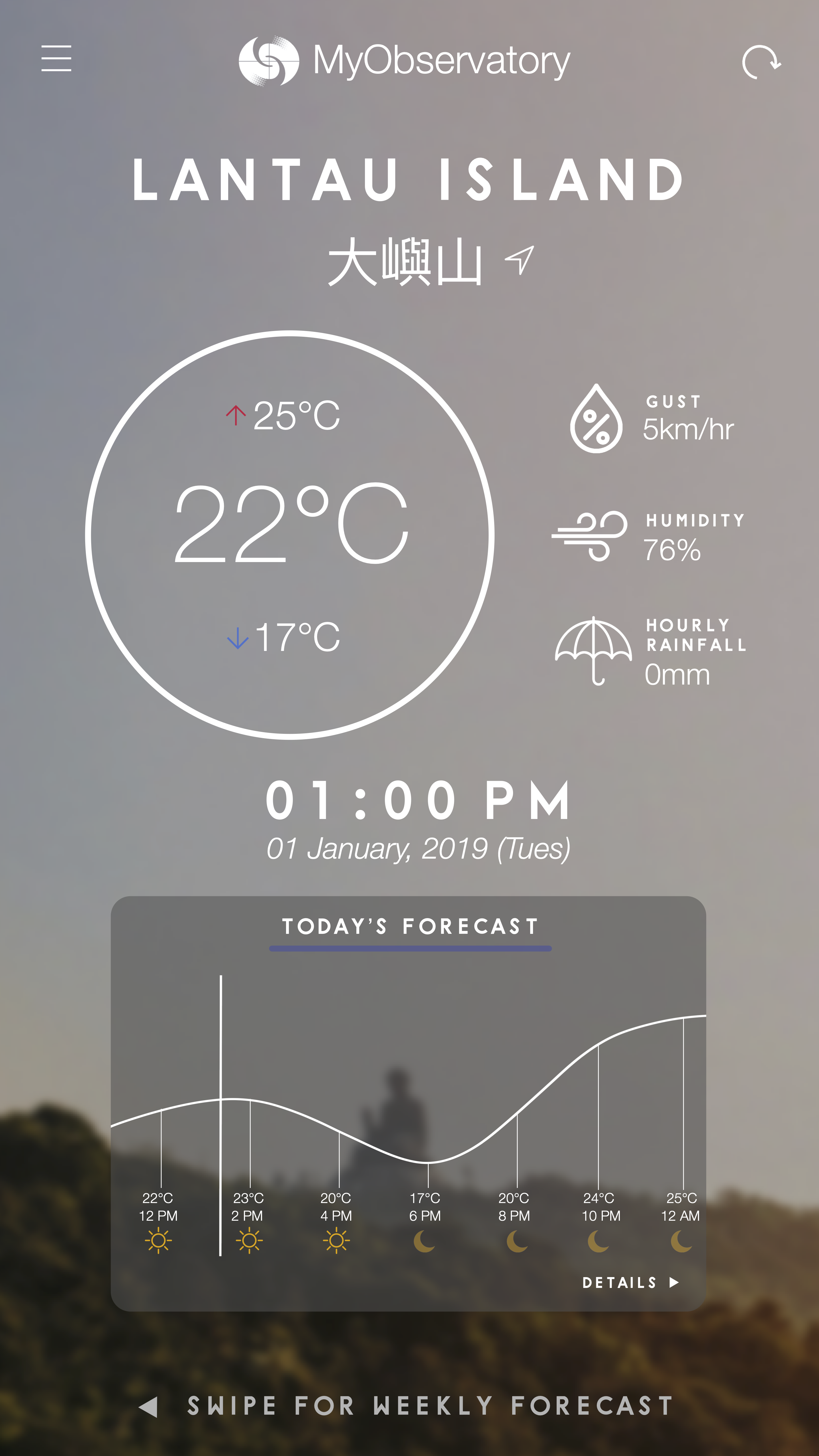
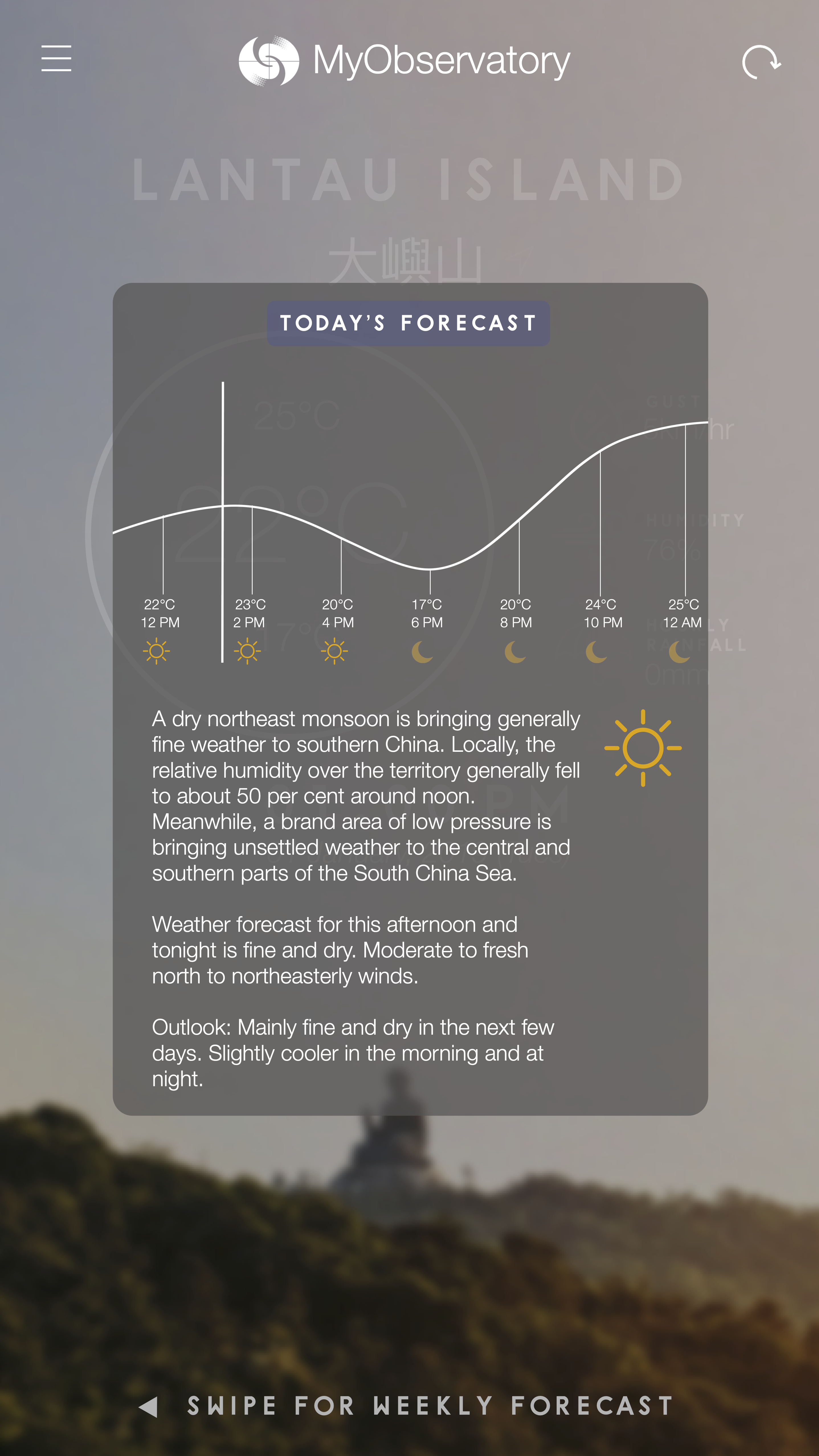
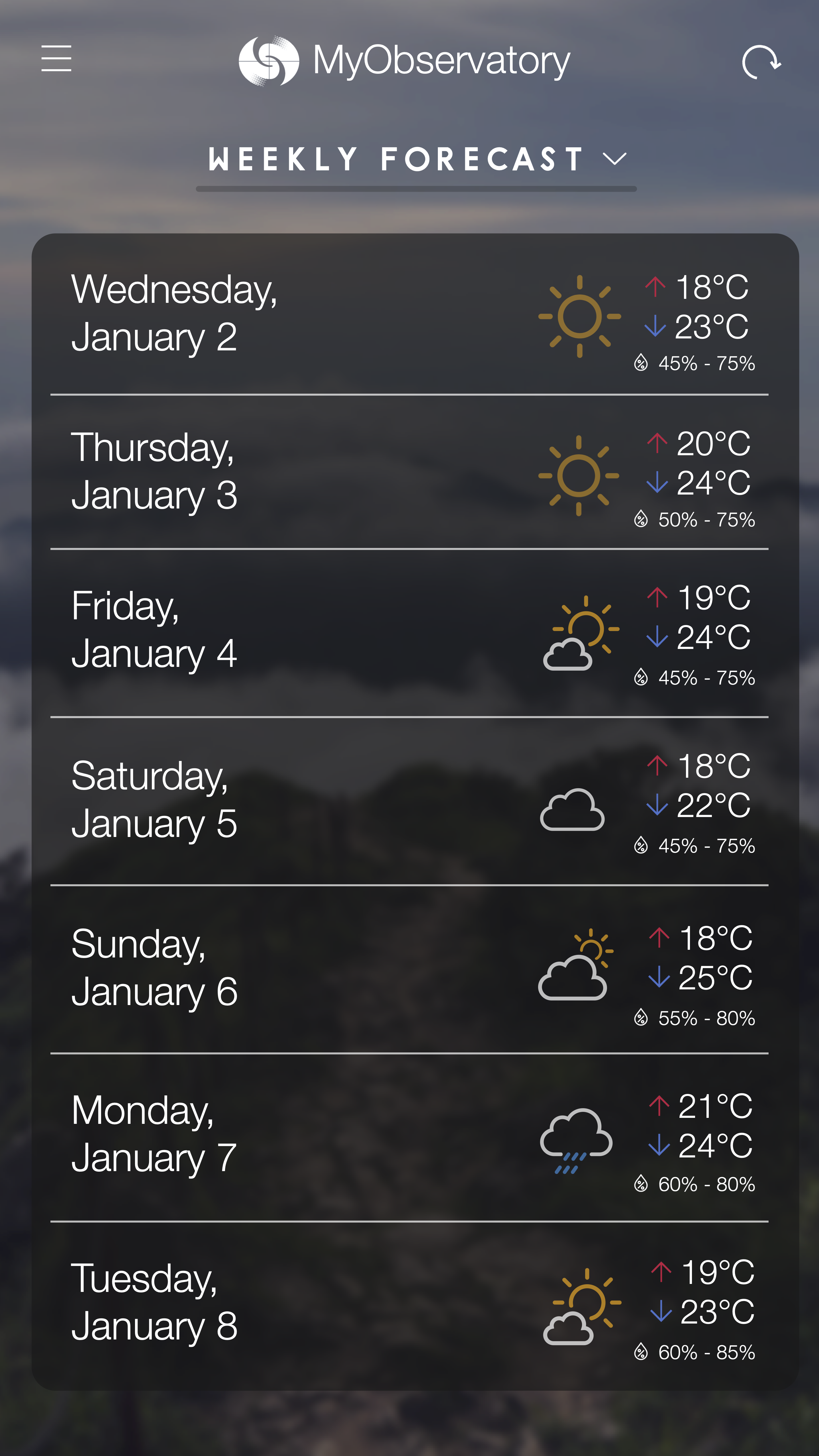
My approach to restyling the visual design of the application still follows a similar structure, but presented in a less visually overwhelming way. The daily temperature (including its highest and lowest temperatures) are presented in a clearer manner, placed higher in the visual hierarchy along with the Gust, Humidity, and Hourly Rainfall. A simple graph indicating the trend of the weather fluctuation can be found near the bottom, with a description of the weather appearing once you touch that section of the screen. Finally, for the weekly forecast, it is available simply by swiping to the left on the home screen, allowing for an optimal, weather viewing experience.
UI/UX Redesign Assignment (2020)


